
A retrospective on Gearbox’s audacious cel-shaded overhaul, the $50 million gamble behind it, and what Borderlands teaches about visual identity for new IP.
In early footage, the original Borderlands looked like almost every other late‑2000s shooter: muddy, realistic, and drenched in shades of brown. It was competent, but it was also invisible. Today it is hard to imagine Pandora without thick black outlines, exaggerated explosions, and loud comic-book colors, yet that identity only emerged after one of the most expensive and risky pivots in modern AAA development.
Take-Two CEO Strauss Zelnick recently pulled back the curtain on just how dramatic that decision was. In interviews recapped by PC Gamer, IGN, and PCGamesN, he described Gearbox pitching a radical art overhaul mere months before Borderlands was supposed to ship. The change would mean roughly another year of work and, by his estimate, about 50 million dollars in additional cost. The publisher was already under financial pressure, but Zelnick agreed. In his words, had they not done it, “Borderlands wouldn’t have been a hit.”
This is the story of how a last‑minute visual identity crisis reshaped an entire franchise, and why the look of a new IP can matter as much as its core mechanics.
The Borderlands that almost shipped
The earliest public version of Borderlands, shown around 2007–2008, bore little resemblance to the game that finally arrived in 2009. Gearbox’s first pass leaned into the grim sci‑fi aesthetic that defined the generation. Think rusted metal, dusty wastelands, and a grounded color palette that sat comfortably next to Fallout 3 or ID Software’s Rage.
By all accounts, it functioned. Borderlands already had shooter-RPG hybrid mechanics, loot-focused progression, and the four-player co-op structure that would become its calling card. But the visual wrapper made it blend into a crowded market. Internally and in early reactions, there was a growing fear that it simply lacked a hook. The mechanics were promising yet not unique enough to fight through the noise on their own.
That creeping dread coalesced at a crucial moment. According to Zelnick’s recounting, just a couple of months before planned release, Gearbox leadership came back to their publisher with a bold admission: the art “wasn’t appropriate” and the game “wasn’t differentiated.” They believed the project needed a new face, not another round of polish.
The pivot to cel-shaded chaos
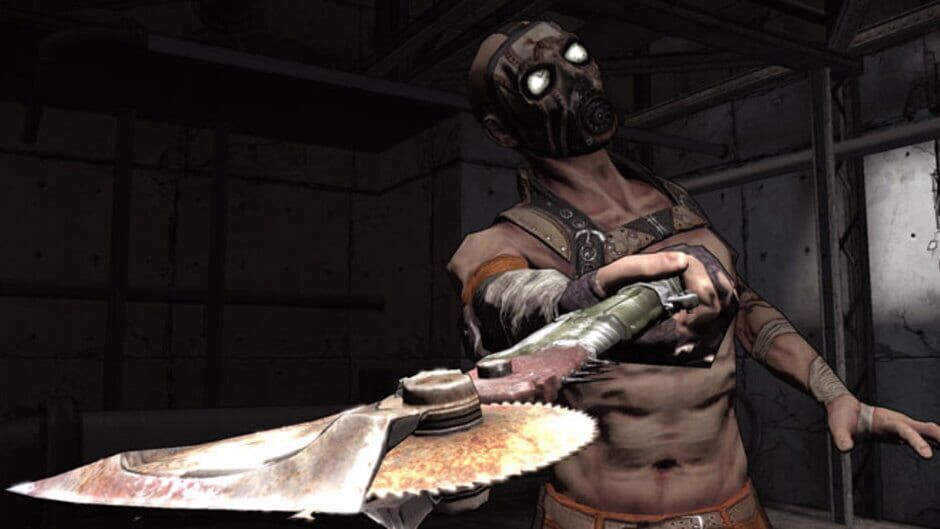
What Gearbox proposed was not a tweak. It was a wholesale reinvention of how Borderlands presented itself. The team wanted to shift to a stylized, almost hand‑inked aesthetic that would look like a hybrid of a comic book and an overcranked Saturday morning cartoon.
This new look relied on thick outlines around models, high-contrast shadows, and color grading that made Pandora’s wasteland feel loud rather than desolate. It amplified silhouettes and turned every gunfight into an illustration rather than a simulation.
The idea did not come from a vacuum. Cel shading had already proven powerful in games like Jet Set Radio and The Legend of Zelda: The Wind Waker, and contemporaries such as Crackdown showed how stylization could help a new IP stand out on a shelf of realism. What made Borderlands unique was how aggressively it married that style to an M‑rated loot shooter.
In practical terms, the overhaul meant reworking assets, lighting, shaders, and post-processing, then ensuring that the new visual direction cohered with existing content and performance targets. By Zelnick’s account, the effort tacked on about a year of development and roughly 50 million dollars in extra cost. That figure is striking when put beside his own reference that Borderlands 2’s whole budget has been estimated around 35 million.
From a spreadsheet perspective, this was irrational. The game had already consumed years of development, Take-Two was not flush with cash, and the shooter market was unforgiving. Yet the pitch was accepted.
The $50 million gamble that redefined a series
Why would a conservative public company sign off on such a late and expensive pivot? Zelnick’s explanation points to a tension that still defines AAA publishing today: the need for both risk management and differentiation.
At that moment, the data told one story. Gritty shooters were selling, realism was the norm, and Borderlands in its original form looked like a safer bet. But the qualitative reality was different. Gearbox, close to the work, could feel that the project had no personality. The idea of a “role‑playing shooter with loot” was hard to pitch without something instantly recognizable on a trailer thumbnail or a store shelf.
Take-Two ultimately sided with the creative read of the situation. Zelnick describes reviewing the request and deciding to “take the risk,” noting that he believed most competitors would have forced the team to ship what they already had. The decision to delay, spend more, and effectively relaunch the game’s visual identity was a bet that the long-term upside of a true franchise would offset near-term financial pain.
History validated the gamble. Borderlands released in 2009 to strong sales and word of mouth, and its unique look became a shorthand for the series. Pandora was no longer just another wasteland; it was the loud, illustrated playground where numbers flew out of enemies and characters broke the fourth wall with glee. That visual consistency then carried seamlessly into Borderlands 2, The Pre‑Sequel, and Borderlands 3, creating instant recognition even for players who had never touched the original.
From a business perspective, the investment can be seen as amortized over an entire franchise rather than a single product. Without the pivot, Borderlands might have joined a long list of capable but forgettable shooters. With it, Gearbox and Take-Two gained a tentpole series that still holds real estate in the cultural memory of the Xbox 360 and PlayStation 3 era.
Visual identity as a force multiplier for new IP
The Borderlands story is often told as an anecdote about bold leadership, but it is also a case study in how important visual identity is for new IP. Mechanical innovation is rarely what catches a casual player’s eye first. It is the thumbnail in a storefront, the key art on a billboard, the three seconds of a GIF shared on social media. In all of those touchpoints, style often beats fidelity.
In 2009, Borderlands launched into a market saturated with technically impressive but visually homogenous shooters. Its pivot did not just change textures; it changed how quickly players could categorize the game. The cel-shaded look signaled irreverence, humor, and heightened reality. Even before someone learned the term “looter shooter,” they could intuit that Borderlands was not trying to be a tactical war simulator.
That clarity matters enormously when you are introducing a new universe. Strong visual identity acts as a form of shorthand that helps audiences understand what emotional space a game occupies. It also sets expectations that mechanics can then confirm or subvert. In Borderlands, the exaggerated visuals make room for bullet‑sponge enemies, absurd weapon stats, and slapstick violence in a way that a strictly realistic art style might not have supported without creating tonal dissonance.
Stylization also offers long‑term advantages. Assets age more gracefully, remasters are easier to justify, and the franchise resists being visually dated by the rapid progress of rendering tech. More than a decade later, the original Borderlands still reads as intentional rather than obsolete, while many realistic shooters of that era show their age.
Lessons for modern studios and publishers
Looking back at Borderlands from today’s perspective, when development budgets have ballooned even further, the notion of throwing 50 million dollars and a full year of work at a late‑stage art pivot might seem untouchable. Few studios have the leverage, and even fewer publishers have the appetite.
Yet the core lesson is not that every troubled project should reboot its visuals. It is that visual identity must be treated as a first‑class design pillar for new IP, not a coat of paint applied at the end of production. The Borderlands pivot succeeded partly because it resonated with the tone and mechanics that were already there. The game’s DNA wanted to be loud, absurd, and over the top; the original art style was the part that did not fit.
For developers, that means aligning art direction tightly with the emotional goals of the game as early as possible, then protecting that vision through the inevitable production compromises. For publishers, it suggests that the riskiest choice is sometimes the one that keeps a project in the middle of the pack. Bland but “safe” can be a slow-motion failure, especially in a market dominated by live-service mainstays and recognizable brands.
Borderlands illustrates another key dynamic: visual identity can transform marketing economics. A distinctive look compresses the cost of explanation. Every screenshot is instantly legible, cosplayers have something iconic to emulate, and derivative works signal free advertising. The return on that 50 million dollar gamble did not just arrive in day-one sales, but in a decade of visual ubiquity.
A franchise defined at the last minute
The best evidence for how crucial the art reboot was lies in how we talk about Borderlands today. When fans remember the original game, they recall the black‑lined bandits, the sky painted in bold strokes, and the comic-style crit markers. The shift to cel shading did not make the gunplay tighter or the loot math deeper, yet it made all of those systems more inviting and more shareable.
In that sense, Borderlands is a reminder that the “look” of a game is not superficial. It is a core part of how players understand, remember, and recommend an experience. Gearbox’s last‑minute decision, backed by a publisher willing to absorb substantial short‑term pain, turned a competent but anonymous shooter into one of the most recognizable franchises of its generation.
If visual identity can rescue a nearly finished game from mediocrity, it is worth asking what could happen if more new IPs treated it as the foundation rather than the finishing touch.